The challenge
I could insert a super fancy and formal text here, but the truth is... The current Brazilian Income Tax System is terrible. The problems start with: most people don't know basic things, like "Should I declare?".
There is also a high amount of them that pay other people to declare because once you download the program, it is almost impossible to start without any guidance. And trust me, there is no guidance. But here comes the worst part: if you do it the wrong way, you'll need to deal with exorbitant fines.
So yeah, it was a hell of a challenge...
My Role
Just everything you're seeing in this project :D
The research
The research was done following several steps, which included: desk research, user interviews, current system analysis, personas creation, problem definition, wireframing and more.
Since this is a well-known system for Brazilians, it wasn't hard to find people complaining about the system online, like video comments, app stores, news, and more. Based on all these problems I created several hypotheses for solving them and put them to the test.
Design choices
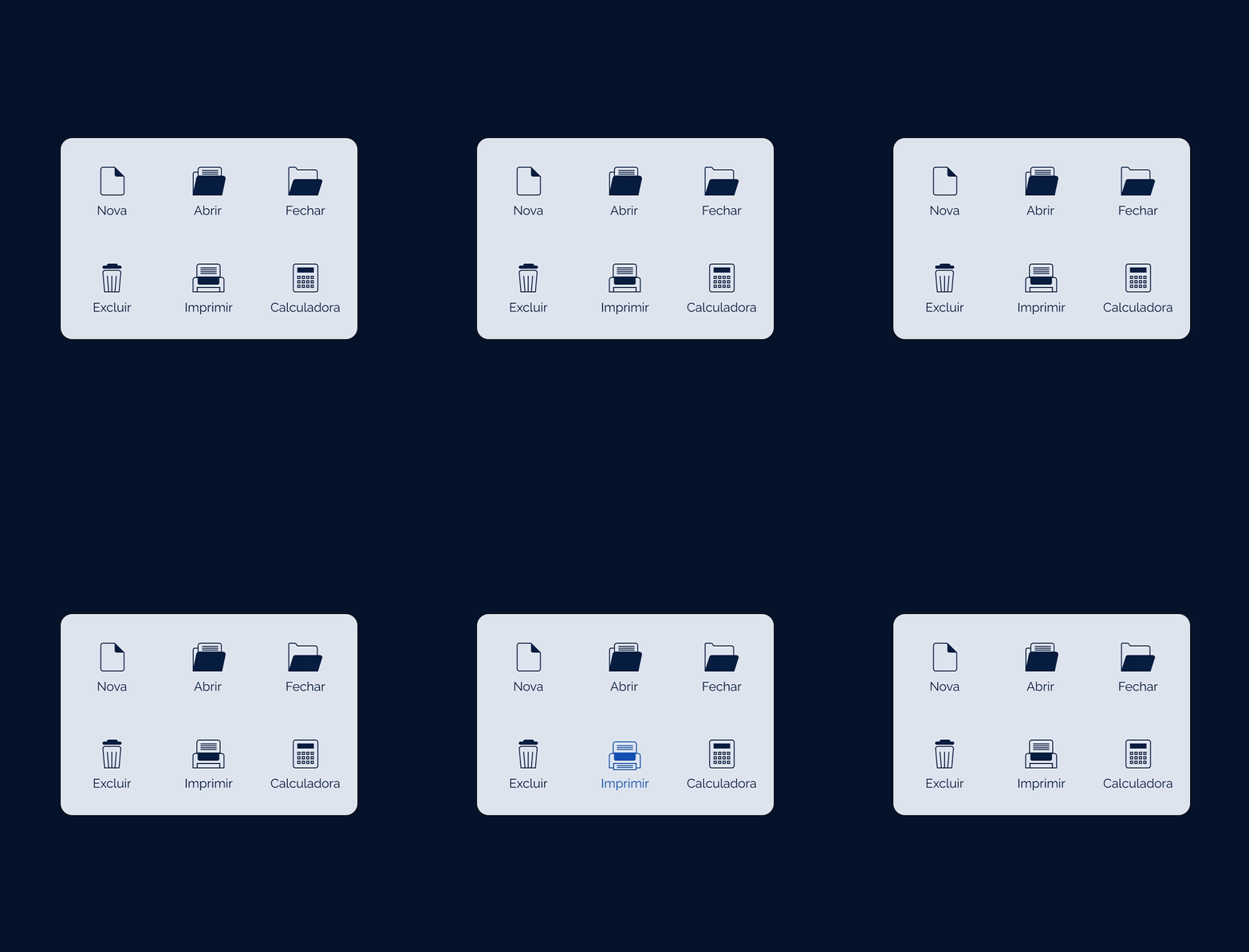
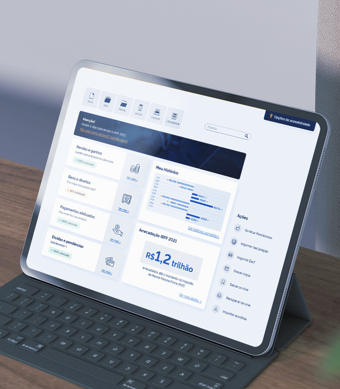
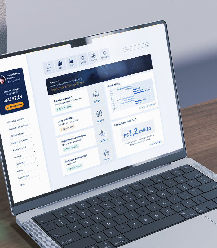
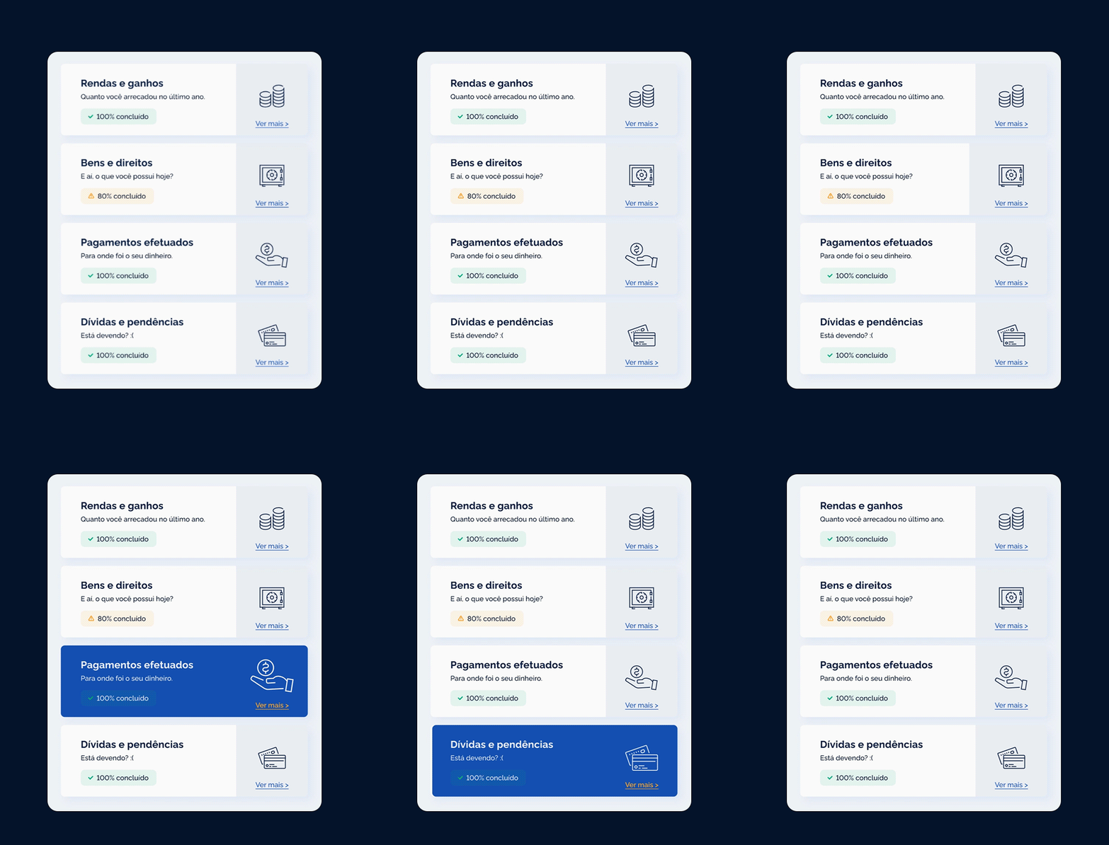
Typography, spaces, colors, grid system, and so on play a super important role in the de design process, due to it, they were all carefully considered on the Brazilian Tax Income System relayout.
The entire project uses a 4pt grid system for consistency between spaces and typography. Typography and colors were chosen based on familiarity. There's a current effort from the Brazilian government to reach better digitalization. For this reason, the typography Rawline and the colors were selected based on the ones used on the Brazilian Government`s official website.
Accessibility Options
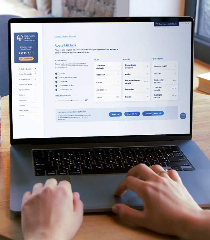
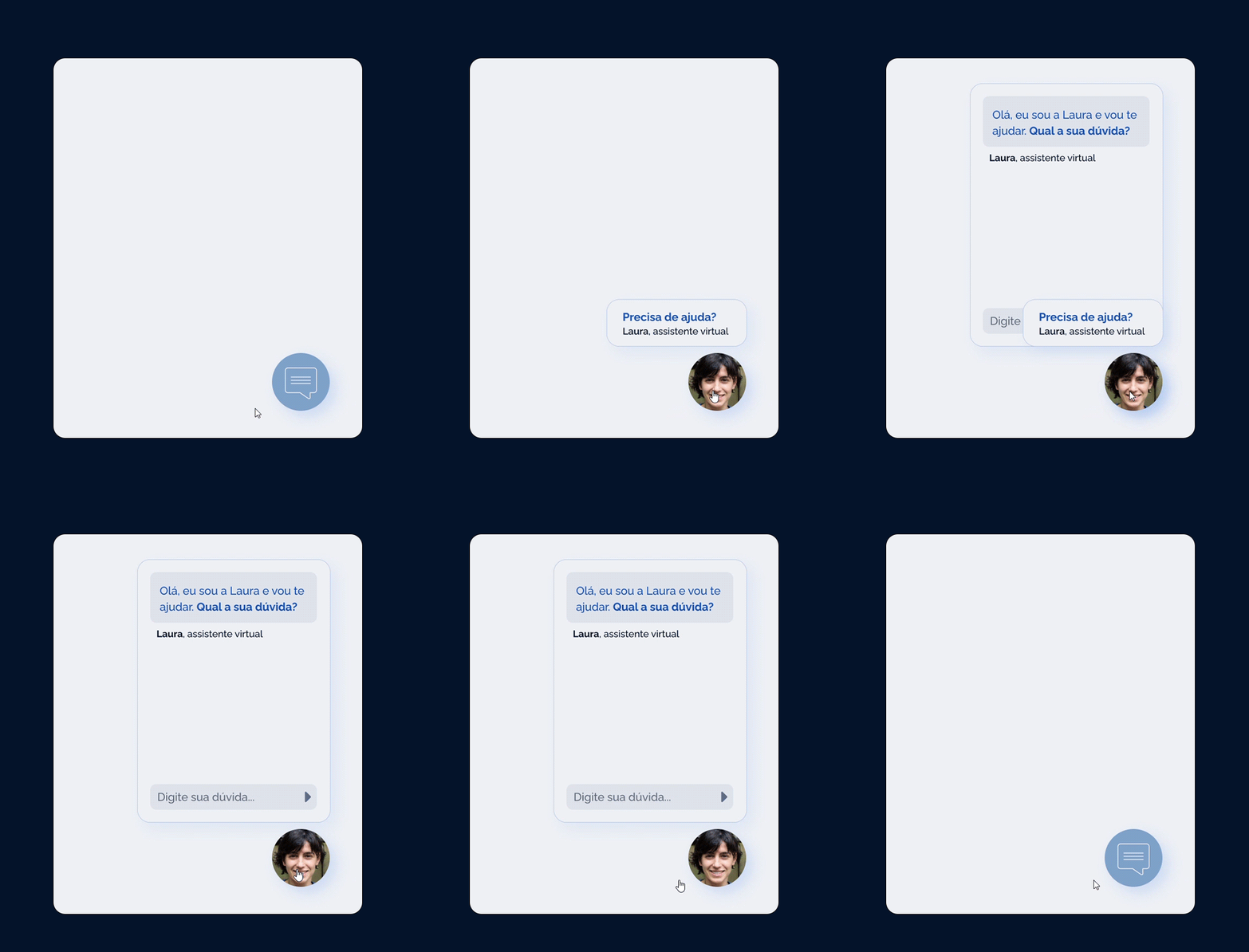
There are various accessibility issues in the current system, including icons without labels, the user can hardly get help from a human, and the lack of visible accessibility indicators on screens, to name a few. In order to address these issues, the new proposal includes various recommendations, including:
1. Fixed chat on all screens: allowing users to easily communicate with a human;
2. Accessibility tag: always present and includes a brief menu of options as well as a button to advance to a screen with more possibilities;
3. Accessibility Focused Screen: A single location for all accessibility options, including custom typography, zoom, and more. It also has forwarding options for customers who prefer to communicate with a human via the phone, chat, or email.
Mobile version
To support the new platform, which is cleaner and has a more fluid process, designs for a mobile version were created, which would be used for both declaring and monitoring personal and government finances.
In terms of enhancing the system's accessibility, the mobile version is also an essential aggregator. After all, it can benefit users who do not have a high income (and may not own a computer) as well as those who choose a different method of submitting their statements.
Campaign for marketing
"You don't have to be afraid of the lion." The lion is well-known in Brazil as the symbol of the country's taxation system. The truth is that the majority of people are terrified by this lion.
As a result, the entire marketing for the new Brazilian Tax Income System revolved around the lion and how it does not have to be your genuine foe.
Bonus - Speed Art
Check how I've created some pieces of this project using Adobe XD.
Confira o artigo! :)
Additional credits
Videos, photos, and other assets from Envato Elements.
Icons hand-drawn, from Envato Elements, and from Linearicons.